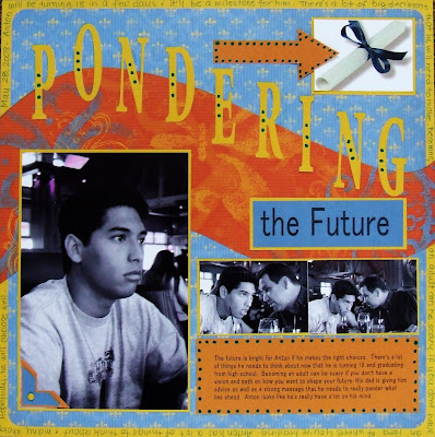
To create this "partial black and white with a touch of color" image, all I did was reduce the saturation but not completely. By doing this, I was able to add a little color to the background. I also changed the hue to "red" as opposed to its original yellow hue. This photo was taken originally in color.
 I created a scrapbook layout with this image. I should have changed the hue to blue but I didn't think about until after I had created the layout.
The photo was taken at a restaurant at the winery that we ate at during the Memorial Day weekend. My son was sitting down looking distant after his father had talked to him about his plans for the future after graduating from high school this year.


0 comments:
Post a Comment